发布:2021/4/8 9:26:09作者:管理员 来源:本站 浏览次数:1109
响应式网页看起来高大上,但实际上,不用JS只用CSS也能实现响应式网站的布局
要用到的就是CSS中的媒体查询下面来简单介绍一下怎么运用
使用@media 的三种方式
第一: 直接在CSS文件中使用
@media 类型 and (条件1) and (条件二)
{
css样式
}
@media screen and (max-width:980px ) {
body{
background-color: red;
}
}
第二:使用@import导入
@import url("css/moxie.css") all and (max-width:980px);
第三,也是最常用的:使用link连接,media属性用于设置查询方式
<link rel="stylesheet" type="text/css" href="css/moxie.css" media=“all and (max-width=980px)”/>
我们只需用到width衍生出的max-width这个属性,定义输出设备中的页面可见区域宽度来控制该改变的样式即可。
下面是一个简单响应式的布局的html代码
-
<!DOCTYPE html>
-
<html>
-
<head>
-
<meta charset="UTF-8">
-
<title>响应式布局</title>
-
<meta name="viewport"content="width=device-width,initial-scale=1.0,maximum-scale=1,user-scalable=no" />
-
<meta name="format-detection" content="telephone=no,email=no"/>
-
<link rel="stylesheet" type="text/css" href="css/mo2.css"/>
-
</head>
-
<body>
-
<div>
-
<header id="head">
-
<ul>
-
<li>header1</li>
-
<li>header2</li>
-
<li>header2</li>
-
<li>header2</li>
-
<li>header2</li>
-
</ul>
-
<div>icon</div>
-
</header>
-
<section id="main">
-
<div class="left">
-
left
-
</div>
-
<div class="center">
-
center
-
</div>
-
<div class="right">
-
right
-
</div>
-
</section>
-
<footer id="foot">
-
footer
-
</footer>
-
</div>
-
</body>
-
</html>
下边是CSS样式
-
*{
-
margin: 0px;
-
padding: 0px;
-
font-family: "微软雅黑";
-
}
-
#head,
-
#foot,
-
#main
-
{
-
height: 100px;
-
width: 1200px;
-
/*width: 85%;*/
-
background-color: goldenrod;
-
text-align: center;
-
font-size: 48px;
-
line-height: 100px;
-
margin: 0 auto;
-
}
-
#head div{
-
display: none;
-
font-size: 20px;
-
height: 30px;
-
width: 100px;
-
background-color: green;
-
float: right;
-
line-height: 30px;
-
margin-top: 35px;
-
}
-
#head ul{
-
width: 80%;
-
}
-
#head ul li{
-
width: 20%;
-
float: left;
-
text-align: center;
-
list-style: none;font-size: 20px;
-
}
-
#main{
-
height: auto;
-
margin: 10px auto;
-
overflow: hidden;
-
}
-
.left,
-
.center,
-
.right{
-
height: 600px;
-
line-height: 600px;
-
float: left;
-
width: 20%;
-
background-color: red
-
}
-
.center{
-
width: 60%;
-
border-left: 10px solid #FFF;
-
border-right: 10px solid #FFF;
-
box-sizing: border-box;
-
}
-
@media only screen and (max-width: 1200px) {
-
#head,
-
#foot,
-
#main{
-
width: 100%;
-
}
-
}
-
@media only screen and (max-width: 980px) {
-
.right{
-
display: none;
-
}
-
.left{
-
width: 30%;
-
}
-
.center{
-
width: 70%;
-
border-right: hidden;
-
}
-
}
-
@media only screen and (max-width: 640px) {
-
.left,
-
.center,
-
.right{
-
width: 100%;
-
display: block;
-
height: 200px;
-
line-height: 200px;
-
}
-
.center{
-
border: hidden;
-
border-top: 10px solid #FFFFFF;
-
border-bottom: 10px solid #FFFFFF;
-
height: 600px;
-
line-height: 600px;
-
}
-
#head ul{
-
display: none;
-
}
-
#head div{
-
display: block;
-
}
-
}
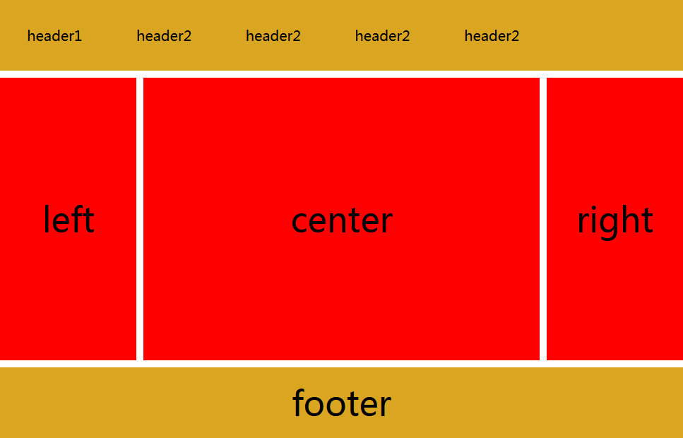
窗口大于1200px时显示的样子


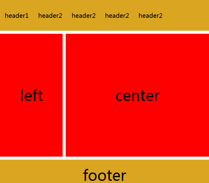
窗口小于1200大于980时,只会被压缩,并不会发生其他变化

当大于640小于980时,右侧栏隐藏

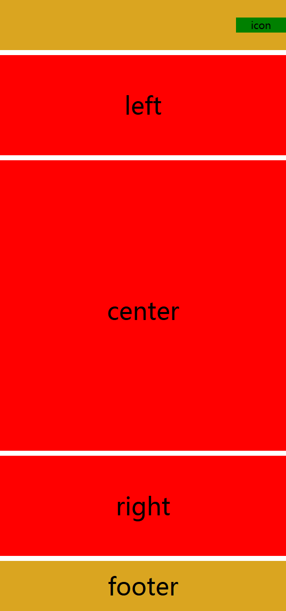
当小于640时,导航栏折叠,body三部分竖直排列显示,若窗口持续缩小,不在发生变化,区域被压缩

好了,布局就这么简单,细节的把握还靠不断地练习。